
Color theory is a fascinating field that studies how colors interact with each other, how they combine, and how they influence our emotions and perceptions. This theory is essential in various disciplines, including art, design, psychology and marketing. Understanding the fundamentals of color theory can help you create impactful visual works and effective messages. In this article, we will explore in depth the fundamental aspects of color theory, its history, applications, and how you can use it to improve your projects.
What is Color Theory?
Color theory is a set of principles and guidelines that help understand and organize colors into harmonious and visually attractive combinations. These principles are based on the color wheel, a circle that organizes primary, secondary and tertiary colors, showing their relationships with each other. Additionally, color theory addresses how we perceive colors and how they affect our emotions and behaviors.
But where does this theory come from? How did it come about? Who formalized it? We’ll tell you then.
History of color theory
Color theory has its roots in ancient times, with philosophers like Aristotle exploring the nature of color. However, it was during the Renaissance that key concepts began to be formalized, thanks to the contributions of scientists and artists who delved into the study of color and its impact.
Some of the most important milestones include:
- Isaac Newton (1666): Newton was the first to demonstrate that white light is broken down into a spectrum of colors when passed through a prism. He created the first color wheel, laying the foundation for the modern understanding of color.
- Johann Wolfgang von Goethe (1810): In his work “Theory of Colors”, Goethe explored the psychological and emotional aspects of color, challenging some of Newton’s ideas.
- Michel Eugène Chevreul (1839): Chevreul, a French chemist, studied the interactions of colors in textiles and formulated the Law of Simultaneous Contrast of Colors, which describes how colors affect adjacent colors.
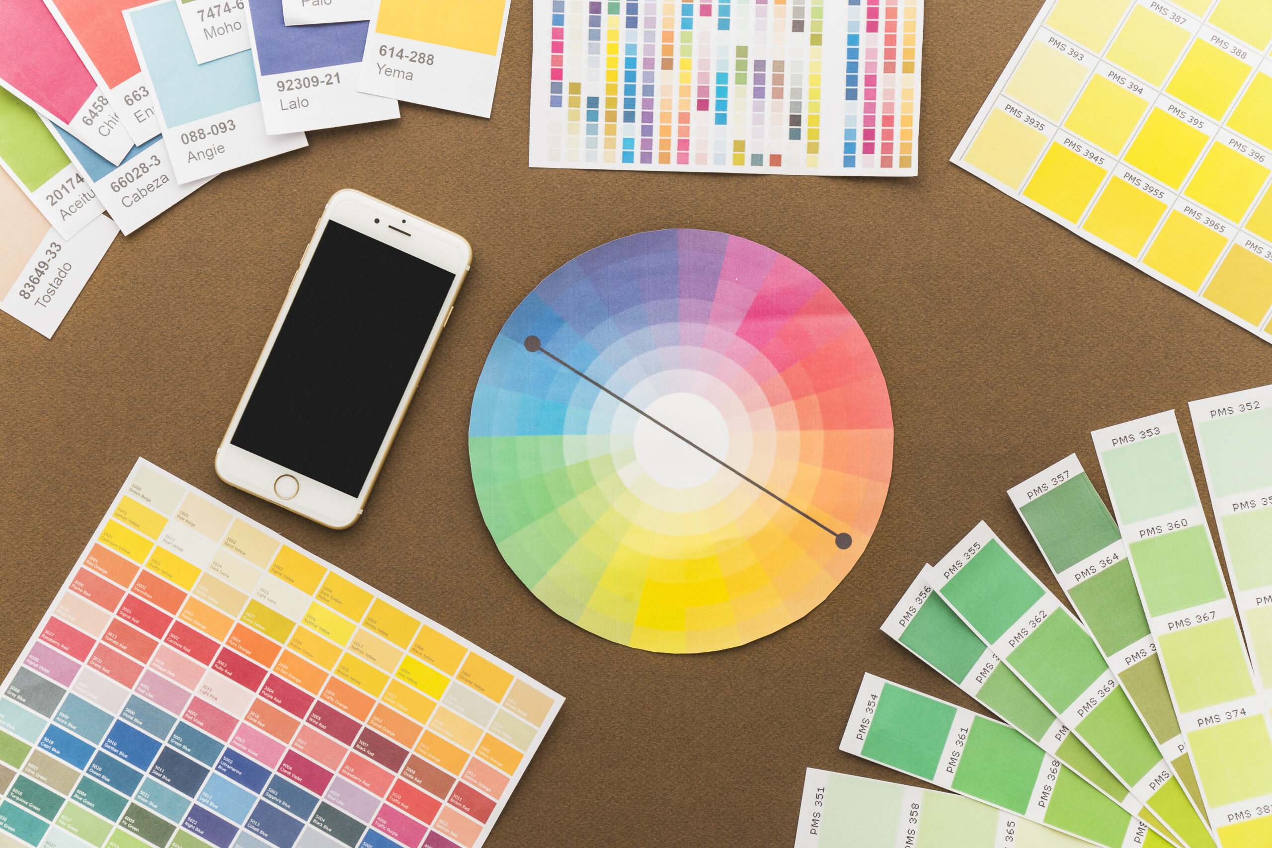
The color wheel
The color wheel is a fundamental tool in color theory. It is a circle that organizes colors in a visual format that shows their relationships with each other. It was created by Isaac Newton in 1666 and has evolved over time to become an essential guide for artists, designers and anyone interested in the use of color. The color wheel is a fundamental tool in color theory. The basic version of the wheel includes:
The basic color wheel is made up of:
- Primary colors:
- Red
- Blue
- Yellow
These colors cannot be created by mixing other colors and are the basis for the creation of all other colors.
- Secondary colours:
- Green: Mix of blue and yellow.
- Orange: Mix of red and yellow.
- Purple: Mix of red and blue.
Secondary colors are formed by combining two primary colors.
- Tertiary colors:
- Orange Red
- Yellow orange
- Yellow green
- Blue green
- Blue violet
- Red violet
Tertiary colors are combinations of a primary color and an adjacent secondary color.
In addition to the basic color wheel, there are more complex versions that include tints, tones, and shadows, providing a more complete representation of color relationships.
Color harmonies
Color harmonies are combinations of colors that are visually pleasing and balanced. They are based on the relationships that colors have with each other on the color wheel. Understanding and applying these harmonies can help you create aesthetically pleasing and coherent designs. Below are some of the most common color harmonies and how they can be used.
1. Complementary colors
- They are opposite colors on the color wheel.
- Example: Red and green, blue and orange, yellow and purple.
- Use: They create a strong and vibrant contrast. They are ideal for capturing attention and creating a focal point in the design. However, its excessive use can be visually exhausting, so it is recommended to balance with neutral colors.
2. Analogous colors
- They are colors that are next to each other on the color wheel.
- Example: Blue, blue-green and green; red, red-orange and orange.
- Use: They offer a harmonious and soft effect. They are ideal for designs that seek to convey calm and coherence, such as in interior decorations or color palettes for presentations.
3. Triads
- They consist of three equidistant colors on the color wheel.
- Example: Red, blue and yellow; green, orange and purple.
- Use: They provide a dynamic and vibrant balance. They are useful for creating a balanced and colorful design without being overwhelming. They can be used in logos, branding and graphics for a strong visual impact.
4. Tetradic or complementary doubles
- They are combinations of four colors that form a rectangle on the color wheel.
- Example: Red and green, blue and orange.
- Use: They offer a rich and complex palette. They are ideal for designs that seek depth and variety. However, it is crucial to balance colors to avoid visual saturation.
5. Monochromatic colors
- Variations of a single color using different shades, tones and shades.
- Example: Different shades of blue, from light blue to dark blue.
- Use: They create a cohesive and sophisticated look. They are ideal for projects that seek simplicity and elegance. They are commonly used in fashion design and minimalist graphics.
6. Split Complementary Colors
- A color combined with the two colors adjacent to its direct complementary.
- Example: Blue with red-orange and yellow-orange.
- Use: They provide less intense contrast than direct complementary colors, maintaining a softer visual balance. They are useful in web design and creating graphics to avoid visual clash.
7. Tetradic or rectangle colors
- Four colors that form a rectangle on the color wheel, including two pairs of complementary colors.
- Example: Blue and orange, red and green.
- Use: They offer great variety and allow for a wide range of combinations within a design. Ideal for projects that require diversity of colors without losing harmony.
Color harmonies are essential for any visual project. Understanding how colors interact with each other and how they can be combined effectively will allow you to create visually appealing and emotionally impactful designs. Use these color harmonies to improve your skills in graphic design, fashion, interior decorating and marketing, and watch how the power of color transforms your work.
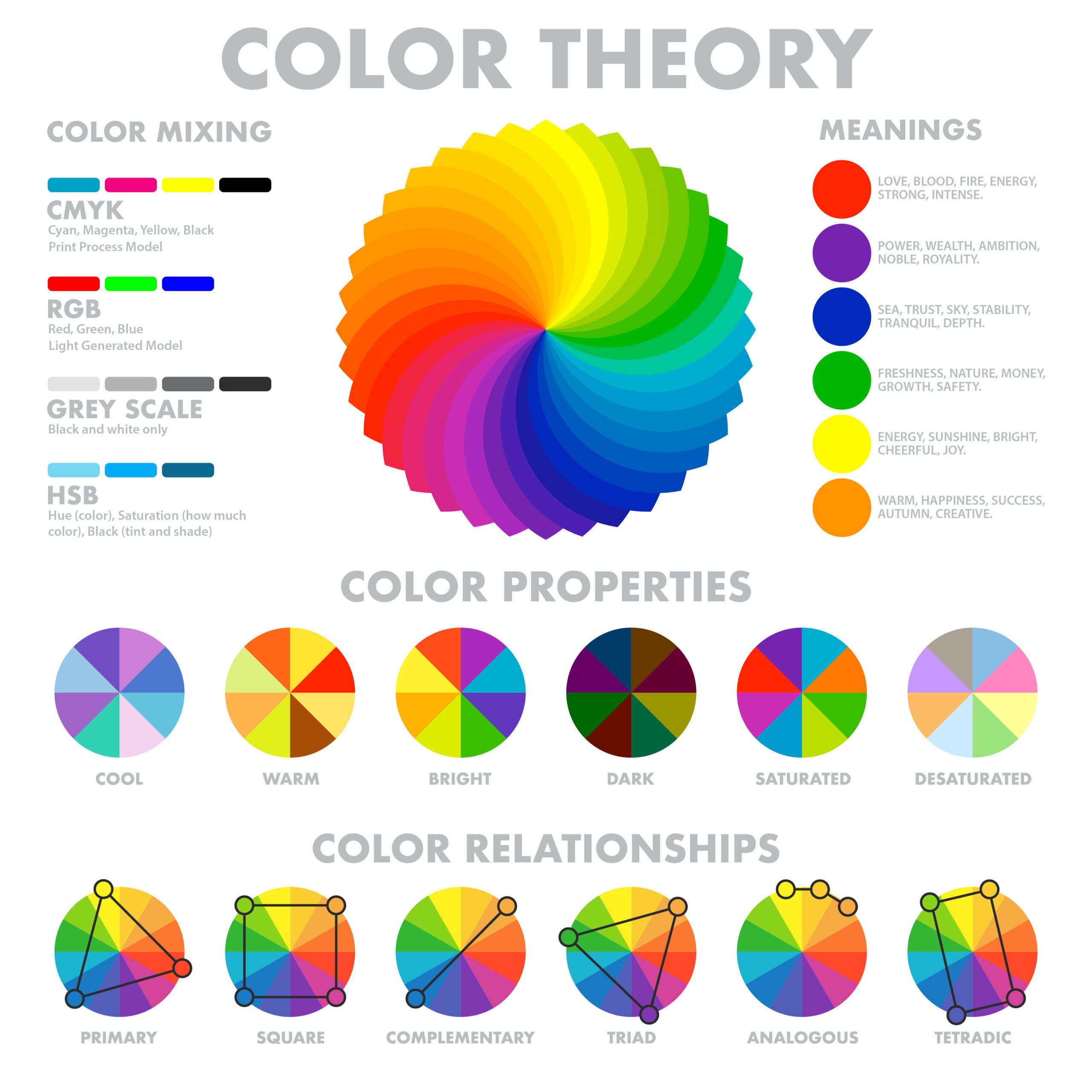
Color psychology
Colors not only have visual properties, but also psychological ones. Each color can evoke different emotions and associations, and these perceptions can vary depending on cultural and personal context. Color psychology studies how different colors affect our emotions, behaviors and perceptions. Colors are not only an essential part of aesthetics and design, but they also have a profound impact on the way we interact with our surroundings and how we feel.
Some common examples of color psychology include:
- Red: Energy, passion, urgency, love, and sometimes danger.
- Blue: Calm, confidence, stability, and professionalism.
- Green: Nature, freshness, growth, and health.
- Yellow: Joy, optimism, attention, and warmth.
- Negro: Elegance, power, mystery, and sophistication.
- White: Purity, simplicity, cleanliness, and innocence.
- Orange: Enthusiasm, creativity, and vitality.
- Purple: Luxury, mystery, spirituality, and sophistication.
Color theory has practical applications in numerous fields, from graphic design and fashion to psychology and marketing. Understanding how colors interact and how they can influence perceptions and emotions allows professionals from various disciplines to create effective and engaging visual experiences:
- Art and Design: Graphic designers use color theory to select color combinations that are visually appealing and consistent. The color wheel and color harmonies, such as complementary and analogous colors, are essential tools. To create harmonious and attractive compositions, and to guide the viewer’s eye through a work of art. Brands use specific colors to communicate their identity and values. A well-designed logo with the right color palette can make a brand memorable and recognizable.
- Marketing and publicity: To influence consumer emotions and decisions, and to create recognizable and memorable brand identities. Colors can influence purchasing decisions. For example, red can create a sense of urgency, while blue can convey confidence and security. The color of a product’s packaging can affect its perception and appeal. Well-designed packaging can stand out on shelves and attract consumers.
- Fashion: To combine clothes and accessories in a stylized way and to express personality and style. Fashion designers follow color trends to create collections that are in tune with current market preferences. Fashion colors can influence the entire industry, from clothing to accessories.
- Interior decoration: To establish the desired atmosphere in a space, from the tranquility of a bedroom to the energy of a living room. Interior designers use color theory to create specific environments. Warm colors, such as red and yellow, can make a space feel welcoming and energizing, while cool colors, such as blue and green, can create a feeling of calm and relaxation.
- Web Design and User Experience (UX): Color theory is crucial to ensuring that websites are accessible to people with visual impairments. Choosing contrasting colors can improve readability and ease of use.
Color theory is a powerful tool that can transform the way we perceive and create our visual environment. Whether you’re working on a piece of art, designing a website, planning a marketing campaign, or decorating a space, a solid understanding of color theory will allow you to communicate more effectively and create impactful visual experiences.
Mastering color theory will not only improve your skills as a creator, but it will also enrich your appreciation of the visual world around you. Dare to explore the world of color and discover how it can influence and improve your work!