
Content
Color theory is not just art; it is a science of sales. At Selfpackaging, where we print thousands of custom boxes every year, we know that color is your brand’s silent ambassador.
Did you know that, according to studies by the Institute for Color Research, people make a subconscious judgment about a product within the first 90 seconds of seeing it? Between 62% and 90% of that assessment is based on color alone.
This guide is not just a theoretical lesson. It is a practical manual designed for entrepreneurs, designers, and marketing managers who need to master color study to stand out on the shelf or in their customer’s mailbox.
What is Color Theory? (And Why It Matters for Your Business)
A Brief History
Color theory is rooted in antiquity, with philosophers like Aristotle exploring its nature. However, it was during the Renaissance that key concepts began to formalize, thanks to scientists and artists who delved into the impact of color.
Key milestones include:
-
Isaac Newton (1666): Newton demonstrated that white light decomposes into a spectrum of colors when passing through a prism. He created the first color wheel, laying the foundation for modern understanding.
-
Johann Wolfgang von Goethe (1810): In his work “Theory of Colours,” he explored the psychological and emotional aspects of color, challenging some of Newton’s purely physical ideas.
-
Michel Eugène Chevreul (1839): A French chemist who studied color interactions in textiles and formulated the Law of Simultaneous Contrast, describing how colors affect adjacent ones.
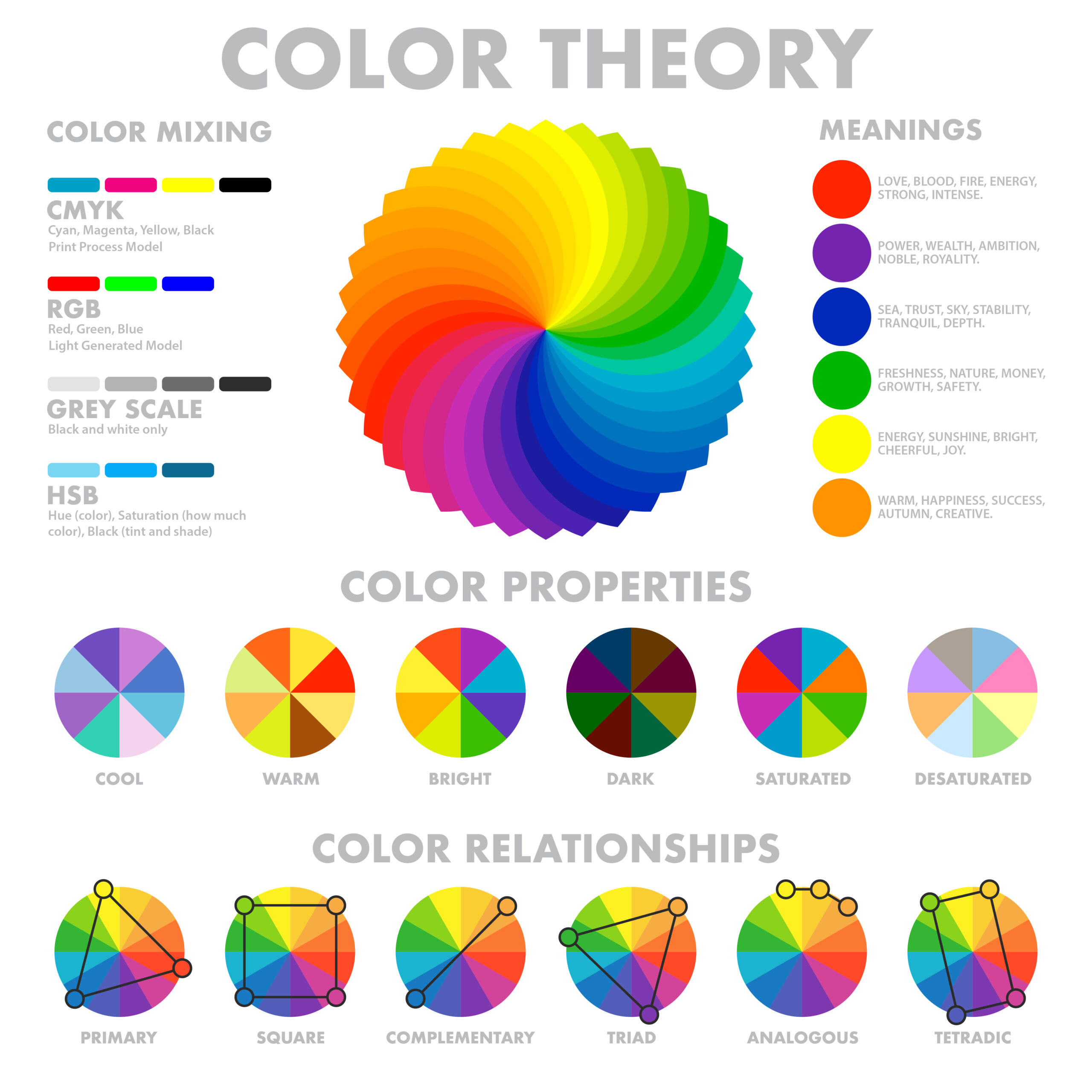
The Color Wheel: Your Navigation Map
The color wheel is your core tool. Let’s break it down—not as artists, but as product strategists:
1. Primary Colors (The Foundation)
Red, Blue, and Yellow.
-
E-commerce Application: These colors don’t ask for permission. Fast food or toy brands use them for immediate impact.
-
Tip: In our digital printing, these colors look extremely vibrant on a white background.
2. Secondary Colors (The Balance)
Green, Orange, and Violet.
-
Use Case: Green is the flagship color for the “Eco-friendly” sector. If you sell natural cosmetics in our Kraft boxes, printing in green reinforces the sustainability message without saying a word.
3. Tertiary Colors (The Sophistication)
Combinations of a primary color and an adjacent secondary color (e.g., Turquoise Blue, Coral Red).
Ideal for: Niche brands, jewelry, or fashion looking to differentiate themselves from mass competition.
Color Harmonies: Formulas for Success
Don’t guess. Use these design mathematical formulas to ensure aesthetic success and emotional impact.
-
Complementary Harmony (To Stand Out): Use opposite colors on the wheel (e.g., Blue and Orange).
-
Effect: Generates maximum contrast.
-
Best for: Impulse purchases or promotional mailers. If your box is brown (Kraft), a Cyan Blue label or ribbon creates a modern, highly legible contrast.
-
-
Analogous Harmony (To Enchant): Use neighboring colors (e.g., Pink, Red, and Orange).
-
Effect: Conveys calm and consistency. It’s pleasing to the eye because the colors share a common base.
-
Best for: Makers, crafts, and weddings. A nude box with a pale pink ribbon and a burgundy label screams “elegance and care.”
-
-
Monochromatic Harmony (The Luxury Favorite): A single color in different shades.
-
Effect: Minimalism and authority.
-
Expert Insight: This is the safest option if you don’t have a graphic designer. Printing your logo in a darker shade than the box color always works.
-
Expert Advice: Be careful with contrast. If the difference in tone is too subtle, the logo might “disappear” when printed on cardboard, which is a porous material that absorbs ink. Always aim for a clear jump in contrast.
-
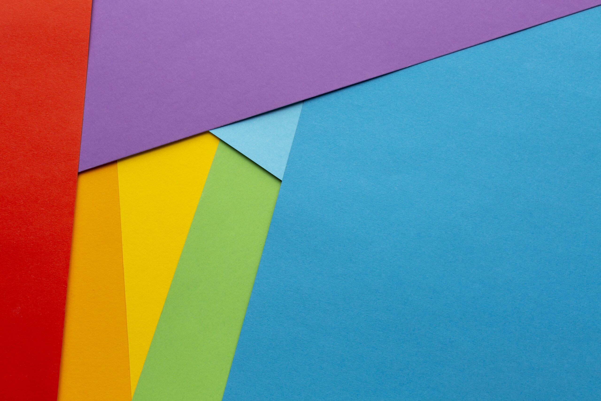
Color Harmony Examples
Color harmonies are color combinations that are visually pleasing and balanced. They are based on the relationships colors have with one another on the color wheel. Understanding and applying these harmonies can help you create aesthetically pleasing and cohesive designs. Below are some of the most common color harmonies and how they can be used.
Color Psychology in Marketing: Data, Not Opinions
Color modifies purchase intent. Here’s how our most successful clients use it:
-
Blue (Trust): A favorite for banks and tech companies. In packaging, it signals that the shipment is safe and efficient.
-
Black (Value): Associated with “Premium” status. A black self-assembling box can justify a higher price point than a standard one.
-
Green & Brown (Honesty): Linked to organic products.
-
Sustainability Fact: At Selfpackaging, we use water-based inks and FSC papers. Using these colors reinforces our shared commitment to the planet.
-
-
Yellow (Optimism): Grabs attention in shop windows, but use it sparingly; in excess, it can cause visual anxiety
Key Statistic: According to Neil Patel and QuickSprout, 85% of shoppers cite color as the primary reason they buy a particular product.
Color theory has practical applications in numerous fields, from graphic design and fashion to psychology and marketing. Understanding how colors interact and how they influence perceptions and emotions allows professionals across various disciplines to create effective and engaging visual experiences:
-
Art and Design: Graphic designers use color theory to select color combinations that are visually appealing and consistent. The color wheel and color harmonies, such as complementary and analogous colors, are essential tools for creating harmonious compositions and guiding the viewer’s eye through a piece of art. Brands use specific colors to communicate their identity and values; a well-designed logo with the right color palette can make a brand memorable and recognizable.
-
Marketing and Advertising: Used to influence consumer emotions and decisions, and to create recognizable brand identities. Colors can sway purchasing decisions; for example, red can create a sense of urgency, while blue can convey trust and security. The color of a product’s packaging can significantly affect its perception and appeal—well-designed packaging can stand out on the shelves and attract consumers.
-
Fashion: To combine clothing and accessories in a stylized way and to express personality. Fashion designers follow color trends to create collections that align with current market preferences. Trendy colors can influence the entire industry, from apparel to accessories.
-
Interior Design: To establish the desired mood in a space, from the tranquility of a bedroom to the energy of a living room. Interior designers use color theory to create specific environments: warm colors, like red and yellow, can make a space feel cozy and energizing, while cool colors, like blue and green, can create a sense of calm and relaxation.
-
Web Design and User Experience (UX): Color theory is crucial for ensuring that websites are accessible to people with visual impairments. Choosing contrasting colors can improve readability and ease of use.
Technical Reality: RGB vs. CMYK vs. Pantone
This is where many make costly mistakes. What you see on your screen is NOT what comes out of the printer.
-
RGB (Screen): Uses light. Bright, neon, and saturated colors. This is what you see on your mobile.
-
CMYK (Printing): Uses ink (Cyan, Magenta, Yellow, Black). This is chemistry.
-
The Problem: The CMYK spectrum is smaller than RGB. That “electric green” logo on Instagram will print as a more muted “forest green” on a physical box.
-
-
Pantone (Corporate Color): Pre-mixed direct inks for 100% accuracy (Used in large industrial runs).
Reminder on materials: Kraft cardboard “darkens” printed colors. If you want your yellow to shine on brown cardboard, you will need “white base” printing or accept a more muted, vintage tone.
Conclusion: Your Brand Deserves Colors that Sell
Mastering color theory doesn’t require a Fine Arts degree—just common sense and knowing your customer. Whether you seek monochromatic elegance for jewelry or vibrant contrast for food delivery, color is your best salesperson.
At Selfpackaging, we democratize design. You don’t need minimum orders of 1,000 units to test your theory:
-
Enter our editor.
-
Choose your box.
-
Test your colors in 3D before spending a single cent.
Ready to apply the theory? Design your custom box now
Reviewed by: Selfpackaging Design Team.
Expertise: Over 10 years helping more than 20,000 brands create their unboxing experience in Europe. Experts in digital and offset printing on corrugated cardboard and cardstock.
Bibliographic Sources: