Content
Craft beer creation is gaining more and more followers. So, for the creators of these drinks, their image is essential. Both the bottle and the packaging need to have that unique touch that sets them apart from the competition and transmits their essence and values.
In this post we show you a few examples that are very well suited to the different possibilities we have when we are looking to create a product with its own identity, whether it’s through primary or secondary packaging.
Primary design with a retro touch
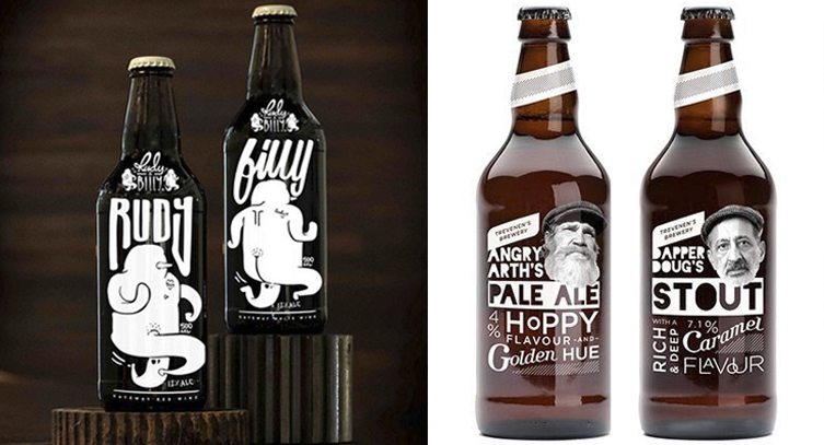
In both these cases, different rounded fonts are used to add a refreshing and modern touch to the product and there is a focus on a primary packaging with the usual amber bottle and see-through labels that give the bottle greater visibility. Using just white, they manage to highlight the graphic contrasts and clarify the message.
Colourful primary design
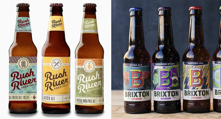
You can also explore more of a vintage touch using labels and textures that transmit the crafted process of the product.
Secondary design using wood and illustrations
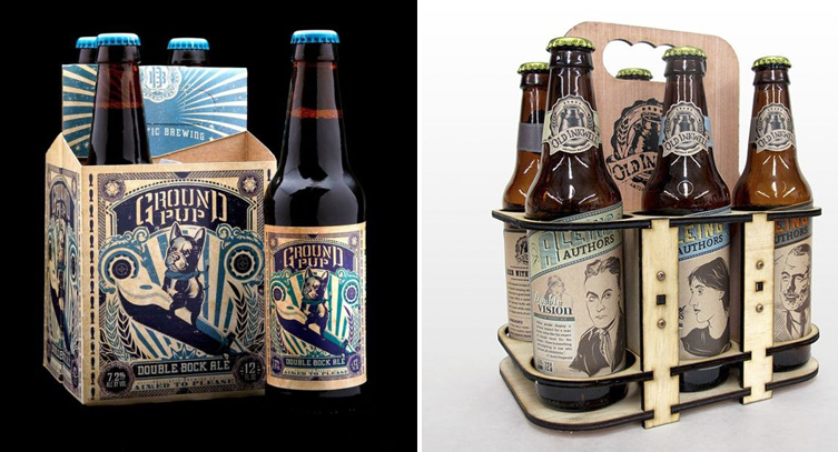
For the box, you can add graphic work to the entire surface or try and make the bottle the focus of your packaging.
Secondary design with fabrics
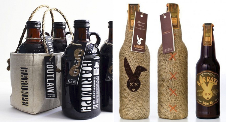
You don’t need to limit your creativity to the materials usually used in each sector. Looking around for other materials that can reinforce your brand is good advice. In this case, for craft beer, there is no better way to sell it than in cloth sacks or even in differently shaped bottles.
Secondary design with sheets of cardboard
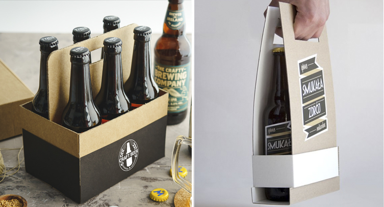
In this case, despite the use of more ordinary materials, the effort has gone into developing the pieces in different structures. At SelfPackaging we have chosen to use these cardboard sheets that join onto a main one, making the handle sturdier and safer for carrying. Smukata chooses this technique but reduces the packaging, adding a premium and more modern touch.

